To create more liveable cities across New Zealand, Leven Property first needed to win the hearts and minds of Kiwis. As a newcomer in a market dominated by established players, building a brand that genuinely resonated with people was essential.
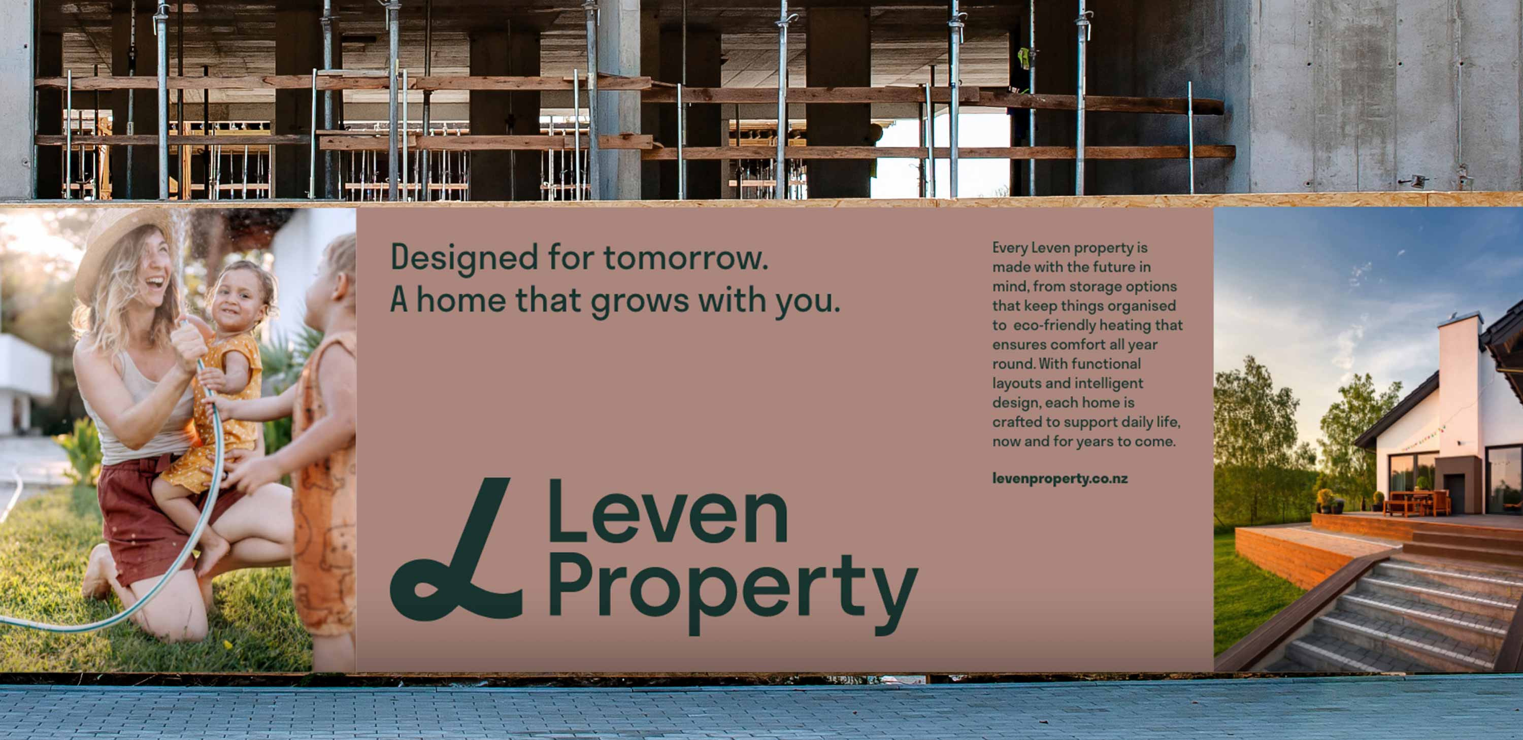
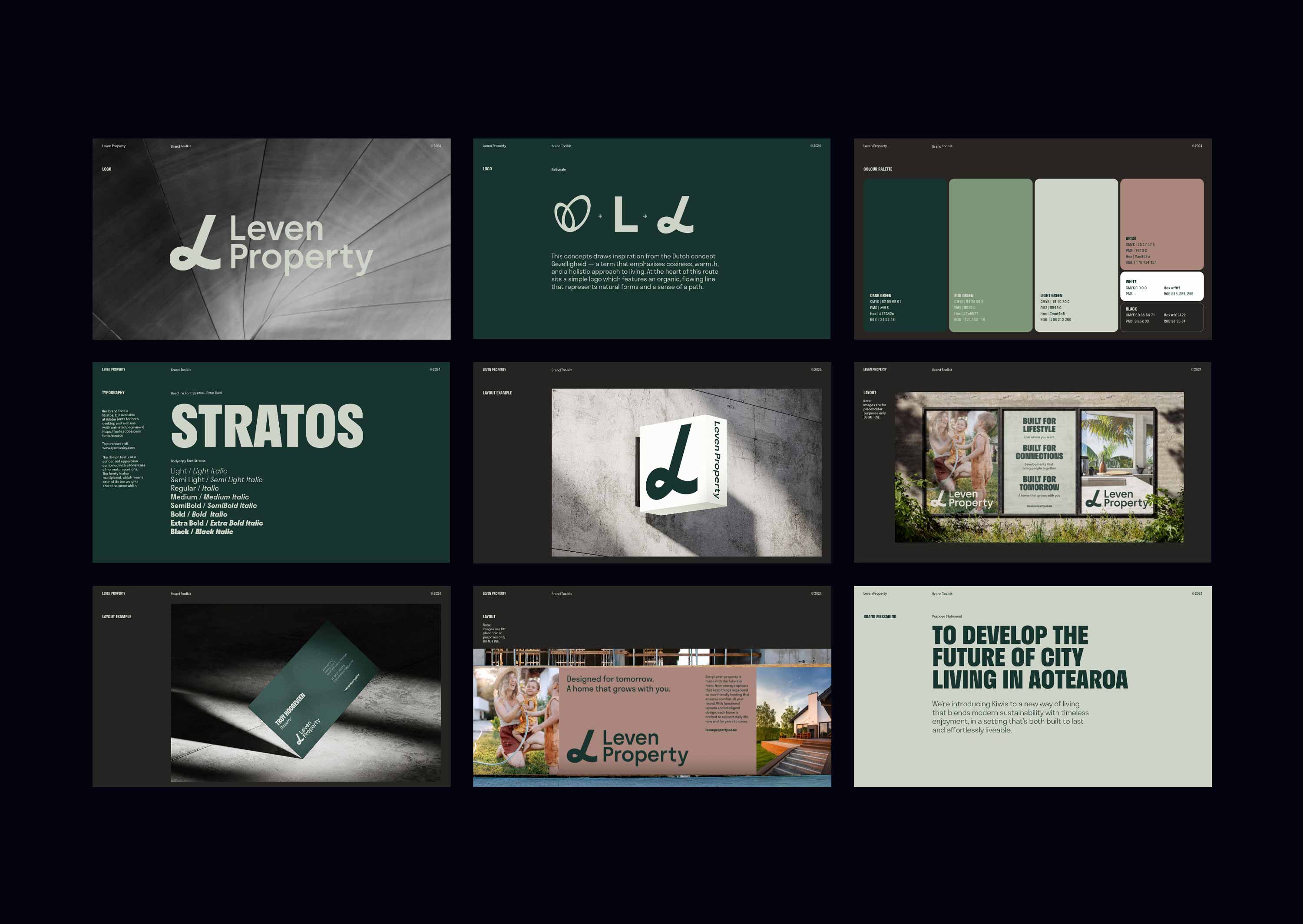
While many would be content to focus on providing high-quality, affordable housing, Leven chose a different path, one rooted in heritage. The name itself, Leven, means “to live” in Dutch, a nod to the founder’s family and time spent in the Netherlands working as a structural engineer.
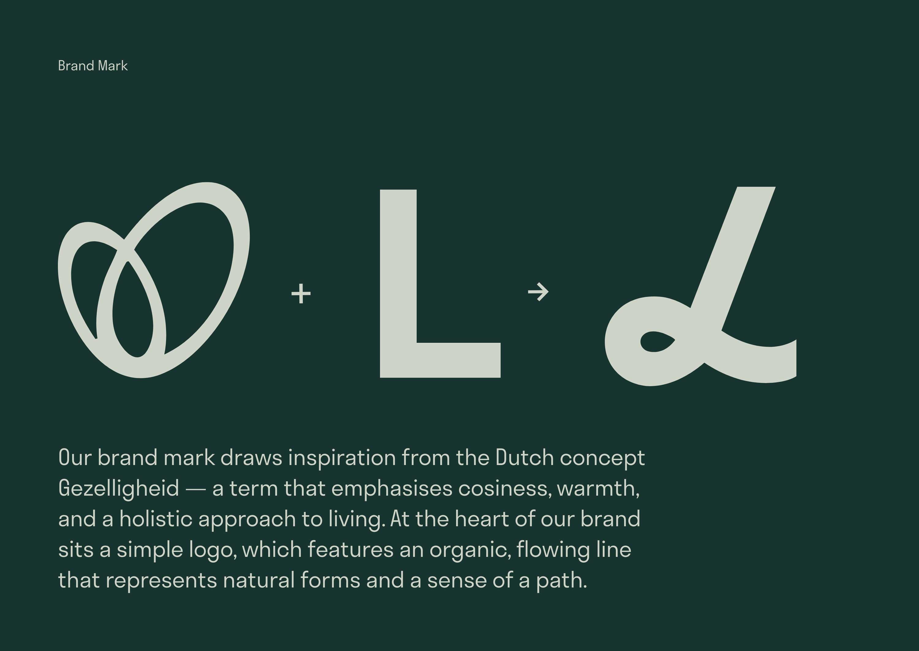
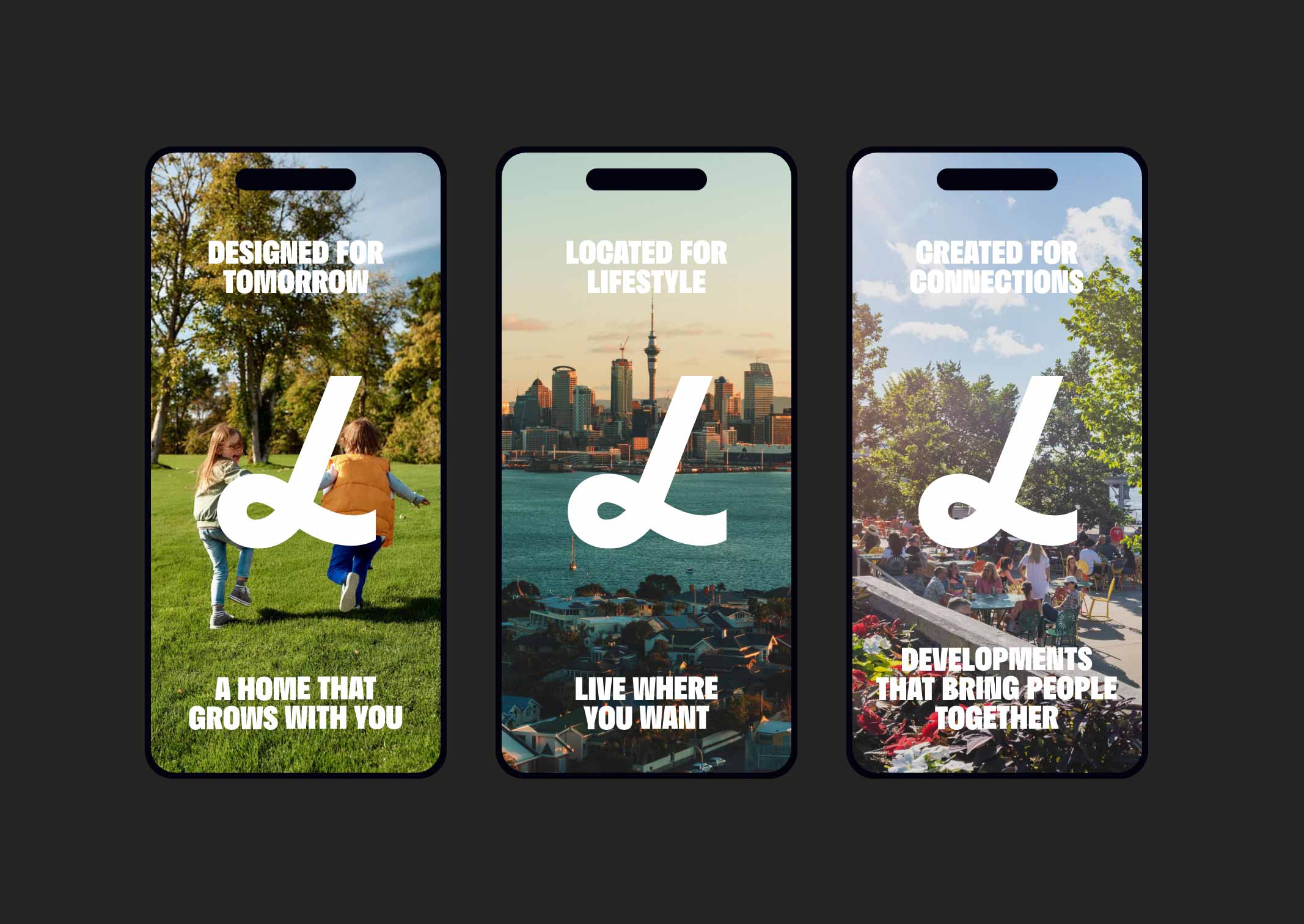
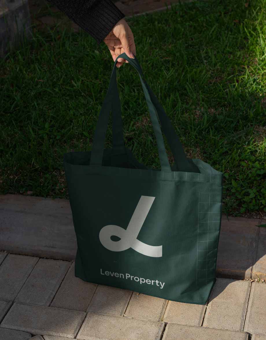
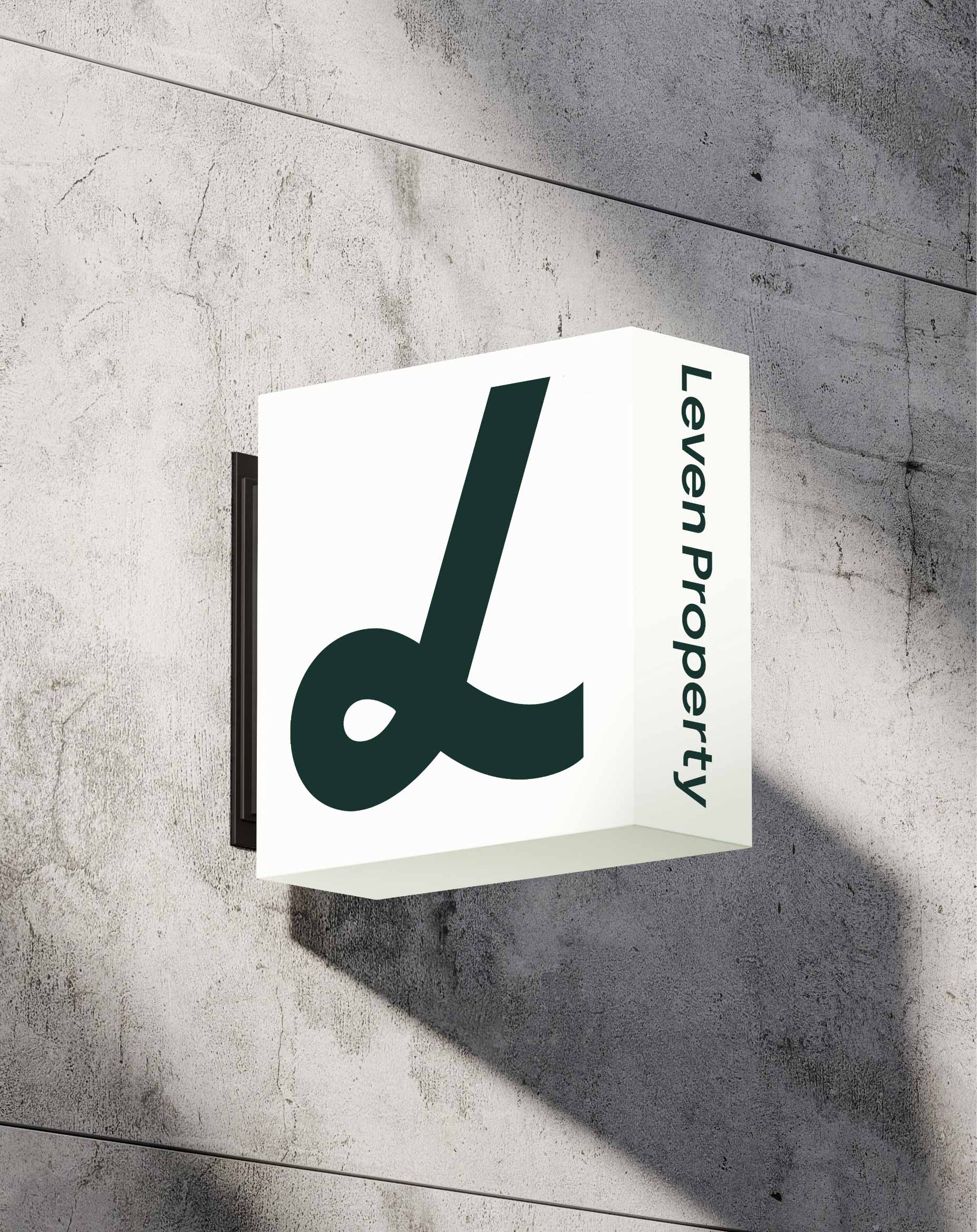
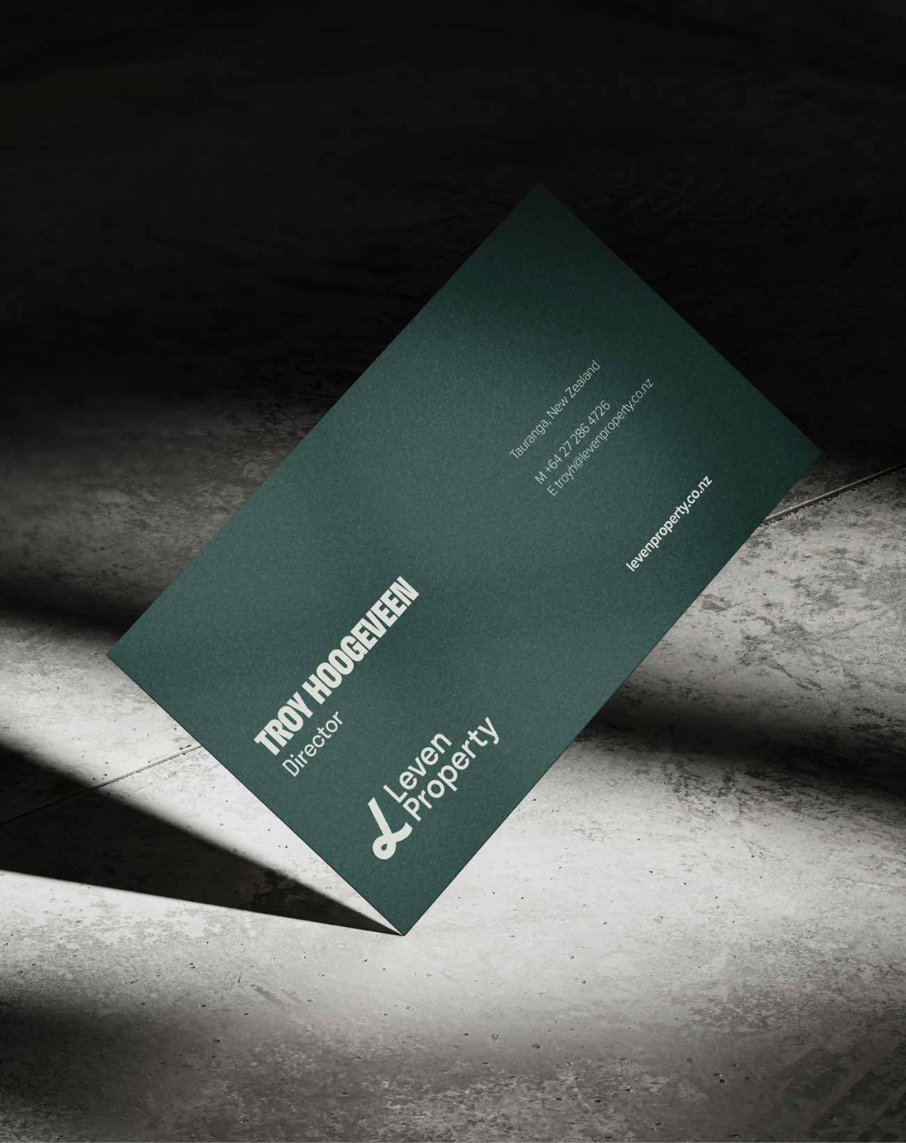
Though the business draws heavily from European principles and design, this became a clear point of difference from the distinctly ‘Kiwi’ companies it competed against. Leven’s identity was inspired by the Dutch concept of Gezelligheid, a word that captures warmth, cosiness, and a holistic approach to living. This was threaded through everything; from logo marks, to language, and colour palette.
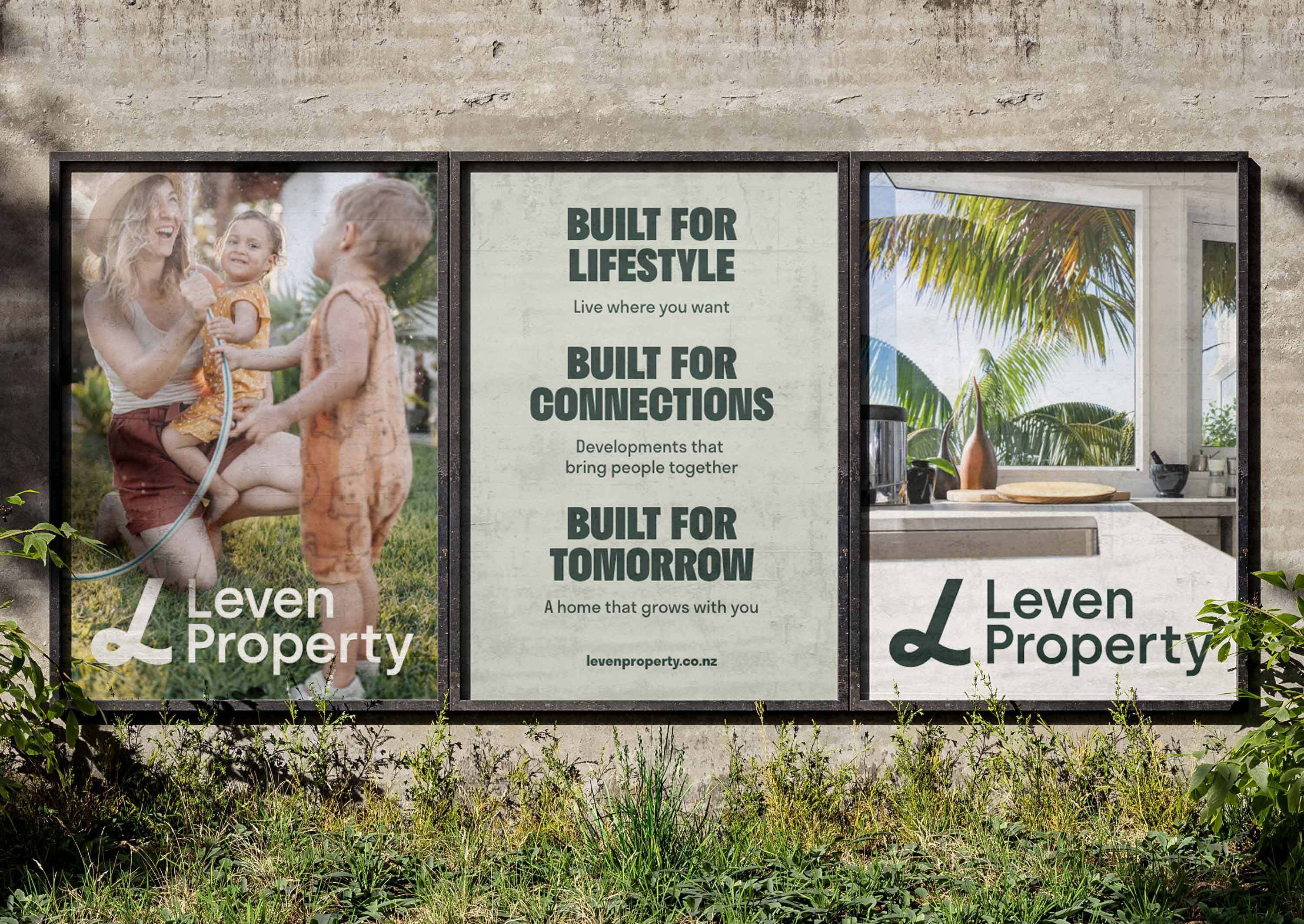
The goal was never just to sell homes, but to offer lifestyles. We wanted people to see themselves reflected in the brand—to feel it aligned with their values and aspirations. To bring that vision to life, we used family-focused, lifestyle-driven imagery set in accessible yet aspirational spaces, familiar enough to connect with, but refreshingly different from the norm.